
Wednesday 5th February 2020
I’ve yet to see a bus in what is officially dubbed the “people-powered new look” actually out on the road so these initial comments come with a health warning it might all look much better when seen in the flesh and I reserve the right to change my opinion.
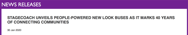
In the meantime I’m relying on last week’s media announcement launching the “permanent new-look bus design shaped by customer research calling for a more simplified and modern service” and the rather uninspiring accompanying photograph showing three vehicles lined up nose to tail in front of glass fronted Doncaster Sheffield ‘Robin Hood’ Airport’s terminal building complete with drab orange block-paving in the foreground and the back of a road sign presumably warning against parking in the area for any length of time for security reasons. I was also intrigued by the cropping that lost the front and back ends of the front and rear vehicles – but perhaps they didn’t add anything much.
For a brand refresh that’s been so anticipated I’m left completely underwhelmed. All the more so with the explanation the new-look is “people-powered”. Surely that’s taking the “people” association a bit far? Call me a cynic but … ‘don’t like the livery?’ ….‘tough mate; it’s been “people-powered”’ and through extensive “customer research” at that, so one dare not criticise it.
To me it smacks of someone at Stagecoach Bus HQ thinking to themselves ‘what can I do to justify my role as Group Director of Some Central Impressive Sounding Workstream’, so they decide it’s time for a brand refresh and call in a tame outside marketing agency with no experience of working in the bus industry (‘fresh thinking’ and all that) who immediately see £ signs especially if they sub-contract to another outside agency who know nothing about the local bus market to do a bit of customer research before coming up with three different new livery options which the aforementioned Group Director can take to the Board. Boards always love a brand refresh if they get to choose from the final three options.
So thousands of customers are asked to share their thoughts on how a “new design could serve you best?” as well as “what would encourage you to use public transport more regularly?”.
It’s not clear how people thought a new design could serve them best but according to the news release back came the result that “37% of people in Britain would use buses more if they were easier to use” (no surprise there) and “69% of customers often found it confusing to find the bus they wanted” (no surprise there). Anyone mention the lack of printed maps perchance, and, depending where the research was carried out – eg Basingstoke – the lack of printed timetables?
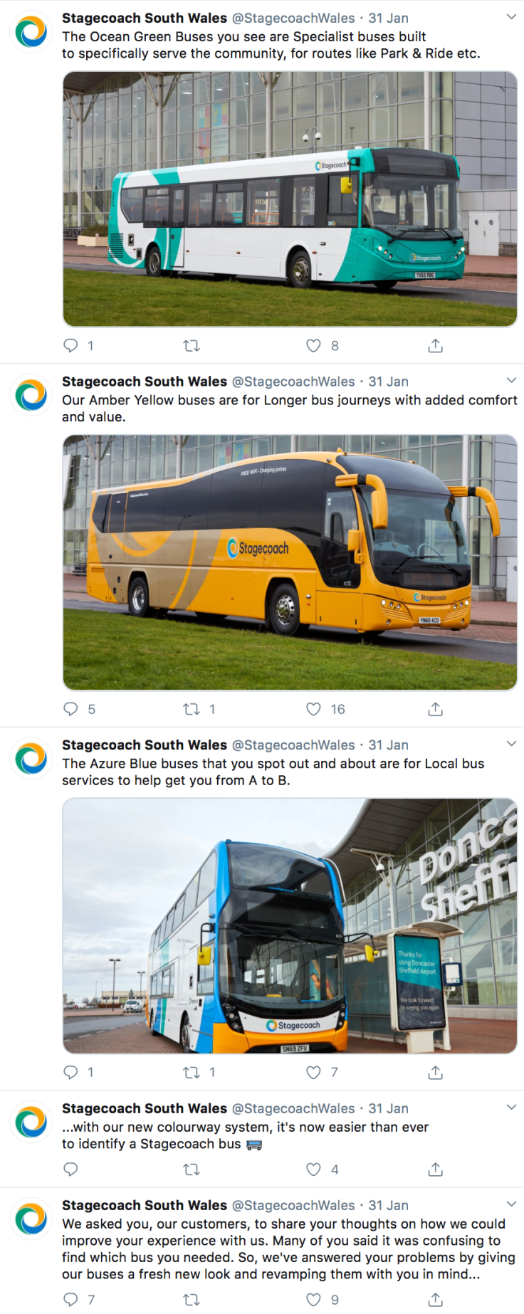
Hey presto; the agency reckon they know what this all means …. let’s do away with the well established Stagecoach Gold brand and all those other high profile individual route brands up and down the country which identify clearly where buses actually go in their local communities and instead have one bland brand for the whole country with three colour coded variations depending on whether a service is defined as ‘local’, ‘longer’ or ‘specialist’ – see, not confusing at all!
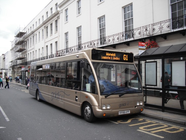
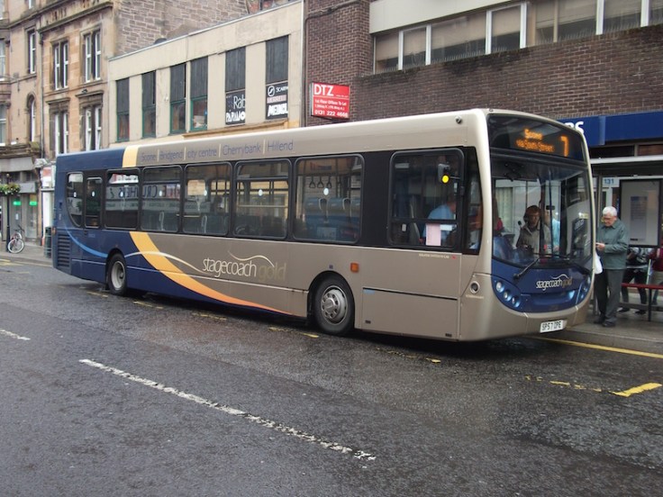
Stagecoach Gold (originally ‘Goldline’) was launched in 2007 amid much fanfare as a way to attract middle-class motorists out of their cars and on to more luxuriously kitted out buses. Initial trials in Warwick (photographed above) and Perth (below) were soon reported as a success with passengers attracted by the improved seating (“hand stitched leather”), improved flooring, soft covering on the interior panels, free wifi and a smart metallic looking livery with drivers in a special uniform and a customer charter. Places served by each Gold route are helpfully clearly listed as part of the bus livery. The last 13 years has seen many more Gold upgrades all over the country presumably attracting more passengers to travel more often.
I’m wondering what aspect of this well thought through branding has led Stagecoach’s big chiefs to take on board customer feedback from the research that it’s “confusing”? Was the specific question asked to tease out whether respondents realise what a Stagecoach Gold branded bus represents and how putting the places it serves on the sides is confusing?
Because on the face of it, there’s nothing more confusing than a one-size-fits-all livery for local bus routes and all the passenger has to inform them is a plethora of route numbers and destinations, especially with maps and timetables hard to find, if they’re even available.
The whole idea of individual route branding is to make it “easier to use” to get those 37% of respondents on board. The country’s most successful bus companies all use route branding very effectively – Nottingham (NCT and trentbarton), Reading and Oxford Bus, to highlight just four of the best, and it’s noticeable how First Bus are really turning things around in the areas they serve by using high profile colour coded route brands – and even more adventurous branding in the Potteries area – to make buses “easier to use” following their disastrous period of a bland Barbie style corporate livery.
It seems a very odd decision for Stagecoach to follow the Arriva model of trumpeting a somewhat insipid national livery rather than the Go-Ahead, First Bus, Transdev Blazefield, Reading, Nottingham et al approaches of using attractive localised liveries and branding. And all with proven successful track records.
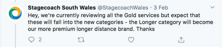
Stagecoach’s social media was abuzz with the new branding news following last week’s launch. Passengers in South Wales for example were given an explanation of the three new categories but I’m not sure they appreciated the relevance of Doncaster Sheffield Airport as a backdrop down in “the Valleys”. Confused? I would be.
As you may have gathered I’m not yet a fan of the “fresh new look” but my view may be tainted by the rather patronising way it’s being launched on to “us, their customers”. And exactly how is it less confusing with this revamped “fresh new look”? Don’t longer journeys also take people from A to B locally along the route? Don’t some specialist Park & Ride buses, or those serving Universities, also carry passengers locally from A to B?
Interestingly Stagecoach South Wales social media faced questions about Gold’s future indicating it does resonate as a brand.
So is Gold “specialist” or “longer”? Does it also carry passengers locally from A to B? I expect the agency will come up with the answer…which won’t be confusing. At all.
The launch reminds me of that infamous policy Sir Frederick Wood introduced at the National Bus Company in 1972, sweeping away much loved local identities and brands in favour of a new national identity that was “really going places”. Within a few years localised branding returned in many areas as part of the MAP project to establish viable networks and encourage more passengers to travel. What goes around comes around.
And I bet that Stagecoach Group Director will soon be moving on to pastures new. Oh; wait, he already has!
I look forward to seeing the new liveries “in the flesh” and my scepticism proved misplaced; especially all that white on a mucky weather day. To end on a positive – I do like the new Stagecoach font. That is an improvement.
Roger French
PS: Off topic: a shout out to South Western Railway (First and MTR). My journey home from Farnham station after visiting Bordon on Friday was delayed by half an hour due to the train being cancelled. I applied for delay repay on Saturday and received a Travel Voucher refund in today’s (Wednesday’s) post. That’s impressive. Well done SWR. By contrast I’m still waiting, even for an acknowledgement, to the cancelled trip to Bristol Parkway before Christmas with sister (First run) train company GWR.

Just wait to see how the smart new livery will look after a few days on well-gritted roads in the North East and when an advert has been applied which covers much of the coloured ‘Beach ball’ on the side. The long distance livery looks like a school bus. At least they have missed the oppertunity of covering the windows in vinyl.
LikeLiked by 1 person
Route branding on buses only works if the branded buses only work on those specific route, which certainly doesn’t happen in my local stagecoach depot. Also how often will the specialist livery actually be used as surely most of these types of services are not commercial services so would the people who fund these services be happy for their services to lose specific branding to a generic company brand.
LikeLiked by 1 person
I’ve been thinking about this since the launch and I still can’t square this question. How are those colours going to make non bus users use the bus?
How about actual publicity being made available at suitable locations, clear timetables for folk to understand, transparent fare information and clever marketing – or as some may call it, GETTING THE BASICS RIGHT could also help…
LikeLiked by 1 person
Ah, so that’s what Stagecoach’s “Business Development” people have been doing for their senior manager salaries now that most of them have been removed from actually running companies [into the ground]: coming up with an irrelevant livery change. It’s about the level of their competence.
Love him or loath him, Stagecoach under Brian Souter just didn’t have this sort of stupidity. He tried leaving once before and the Group was rapidly pulled down by the mediocraties who consider themselves “corporate managers” but who don’t understand either corporations or management, to the extent that he had to return to rescue his own Group. I wonder if he’ll have to return again to save Stagecoach from becoming the FirstGroup of the 2020s?
LikeLiked by 1 person
The Stagecoach “relivery” raises a number of questions:
a) how does the insipid green appearing in Cambridgeshire and Manchester fit into the overall scheme?
b) what is the definition of a “longer” bus route – maybe 5 miles, or 10, or 15, or more?
c) how does “amber” square with the popular culture definition of yellow buses (except in Bournemouth and Nottingham) as school transport (I see that Alan has already raised this above)?
LikeLiked by 1 person
Good points Ian.
LikeLike
I don’t know if it’s still the case, but GWR’s complaints and refunds function was outsourced to Capita, whose mission is “We deliver innovative solutions and simplify the connections between businesses and customers, governments and citizens”.
They certainly leave their mark in supplying flawed responses to complaints, together with delayed refunds, compared with in-house specialists, employed directly by the train company.
LikeLiked by 1 person
Spot on.
LikeLike
I’m no fan of the idea to completely standardise the livery, since I share your concern that all routes will look the same and that will confuse passengers. However, I do actually quite like the new livery, now I’ve actually seen it in the flesh (albeit with faces rather than pastel colours for the blue, green, and orange sections). I was stunned to see it go past me while minding my own business in Newcastle city centre. It struck me as very clean and simple, which I rather liked – some liveries can look awfully cluttered. I think the biggest issue is that the white will certainly get dirty over time, unless they’re washing the buses extremely regularly.
LikeLiked by 1 person
Look at the Stagecoach “circles”: the big “livery” circle and the small “fleet-name” circle are rotated differently . . . that is just sloppy.
LikeLiked by 1 person
Bet Ray Stemming will be screaming with horror about Stagecoach’s obvious policy of “Creating Disaster”
LikeLiked by 1 person
I am not one of CreatingDesires biggest fans but you are 100% spot on. His livery is much better than this rubbish.
I’ve seen kids drawings better than this livery.
LikeLiked by 1 person
Hi Peter being a share holder in Stagecoach from day one have never ever been to one of the AGMs but I think the sir Brian Sutter and his team of workers have done very well to keep this bus company going but my opion is as much as its worth I think that the present livery is great it looks very smart when it’s clean and should be kept I think the Gold livery is very drap and dull when the shine comes of so please Stagecoach management spend the money on keeping the buses running full and profitable Robert Franklin
LikeLiked by 1 person
Well my comment onthe new livery is that the present livery looks fine so why waste good money on the present livery get rid of that drab looking gold colour more money being wasted just keep the services to the public relible
LikeLiked by 1 person
I certainly agree wholeheartedly with your summary Roger and most Respondents horrified comments. “Insipid” is probably the politest work I can think of, and why to God change a perfectly good, recognisable throughout the UK (literally), livery that almost Everyone associates with the respect Stagecoach is now held by most?. It makes some of the horrors First now produce (yellow fronts slapped onto the peculiar pasty greys of the nightmare “corporate” mess behind in Glasgow to name but one) look respectable. And how on earth do they think the public cares or knows whether a bus is on a “local”, medium distance or long route? Even the magnificent Oxford Tube deckers work odd local journeys. Apart from checking the calendar to ensure it wasn’t April 1st, only two things screamed out to me after seeing this collective mess/madness. (1) “Emperors new clothes” and (2) clearly Sir Brian must have fully retired and handed his gate pass back.
LikeLiked by 1 person
Currently, most bus operators are opting to relaunch routes with new local liveries on buses and really showing off what the bus has to offer on a local level. They are doing this because it is PROVEN to increase passenger numbers (See GNE and Transdev).
Instead, Stagecoach are opting for a new corporate livery, which looking at press releases suggests it will override specialist local brands. I take it that they don’t actually know or don’t care about the proven research which has been done which helps increase bus use (and therefore revenue).
Which buffoon thought this was honestly a good livery. The management and designer need sacking.
LikeLiked by 1 person
What on earth is meant by new [sic] “colourway system”? presumably this means having different liveries for local buses, coaches, and other buses . . . errr, just like bus companies have been doing for years, and the NBC developed with its National branding for coaches. Really, what a load of codswallop.
LikeLiked by 1 person
I really don’t know how a company like Stagecoach, who have been prominent at upgrading the standard of bus travel over the years, can come up with something that looks just so…..naff!
LikeLike
I was horrified when I saw the Stagecoaach press release. Like others I really did think it was an early April Fool gag.
They will be mad if they go ahead with this. As others comment their current livery and palette are an incredibly strong trademark, brand and identifier. Their colours of red, blue, orange and white together are very powerful indeed. All that was needed was a re-tweek of the existing livery, but with some red on the front, as the frontal view was never quite so strong as the rear.
LikeLiked by 1 person
Staff at Gatwick Rail Stati0n need to know the rules on railcards. 07.25 to Cambridge is eligible so please let people through the barrier. After an overnight flight you don’t want some flathead telling you that Sheringham is in the London zone so 09.30 it is!
LikeLike
Stagecoach new livery has lost the plot this discipline mad company is in free fall run by people with grandeose ideas the livery is awful stop before it’s to late
LikeLike