Thursday 1st August 2024
Welcome to another month’s miscellaneous matters. Those little things I spotted while travelling around during July but not so far blogged about ……. and first up a quick report on a journey I took from Tring to Chesham on Red Eagle operated route 199 at the beginning of the month….
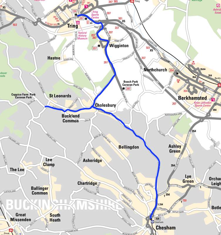
The secret route 199

I found myself in Tring on a Wednesday morning for some personal business and originally planned to travel onwards to Aylesbury on Arriva’s X5 but overhearing a lady waiting at the town’s main bus stop about her imminent journey to Chesham on a once a week bus route led me to consult the timetable at the stop and find there was indeed a route 199 running one return journey a week which was heading back to Chesham in a matter of minutes.
Being a lover of odd ball infrequent bus routes I instantly changed plans and decided to join her on a ride across the Herts/Bucks border to Chesham.
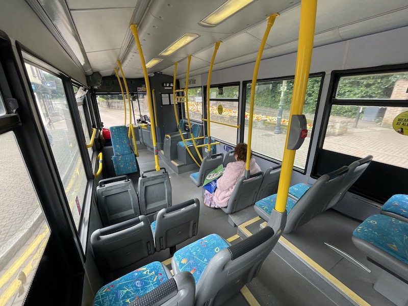
As the two of us settled down as comfortably as we could on the seats, we were joined by another passenger at the town’s large Tesco before we headed off into the countryside and I began wondering why I’d never come across route 199 before.
Being a cross border route, with Tring located only just inside Hertfordshire, it doesn’t appear on that County’s superb network map…

… and the network map for Buckinghamshire is a game of battleships rather than a map so a casual look at it to see where routes go doesn’t really help.
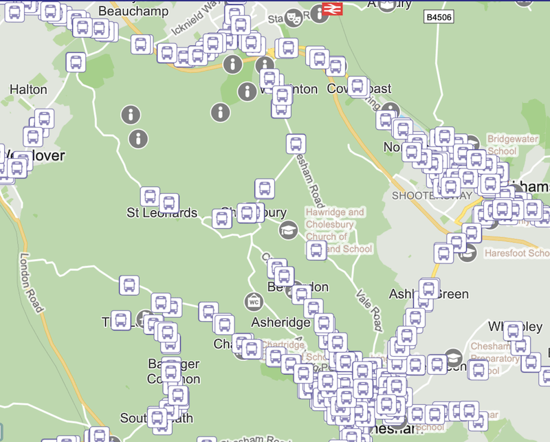
Luckily I found the timetable deep in Red Eagle’s website along with other oddball routes it operates in Buckinghamshire.

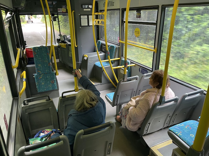
It was a lovely ride and when we dropped the Tesco shopper off on the double run to the village of St Leonards, another passenger was waiting to travel to Chesham so, aside from myself, that made three passengers. Not many, I know, but better than a DRT would achieve on a 34 minute run!
Parts of the route are quite narrow necessitating some skillful driving by our driver…

… and by motorists as well, as they squeezed past us.

And yes, as you can see on that window, “wear a face mask at all times” is the message to Red Eagle passengers.

In case readers find themselves in Chesham or Tring on a Wednesday morning and fancy a secret rural bus ride, this is where route 199 goes if it ever were to appear on a bus map.
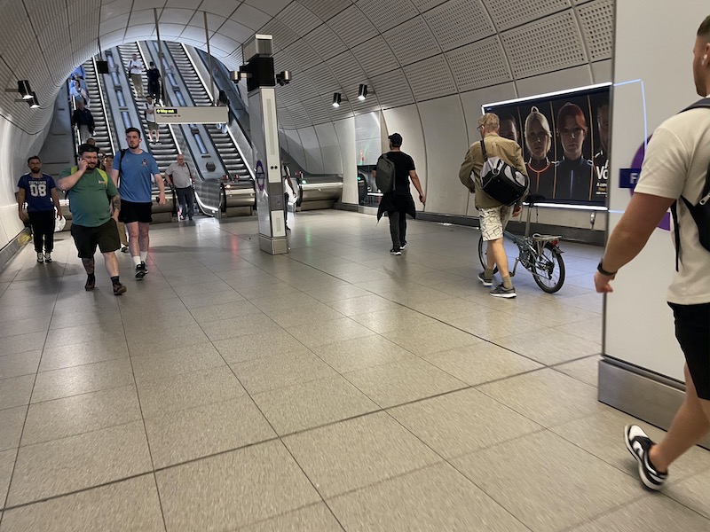
Farringdon peak time crowds
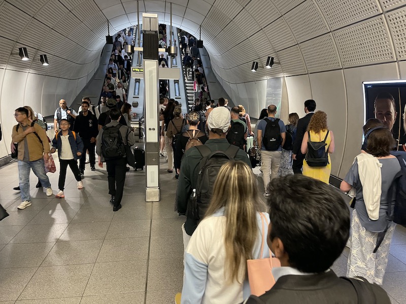
Meanwhile at the other extreme of passengers per hour, a ride on the Elizabeth line through its central core at peak times is always busy as seen here at Farringdon …
… although some of the crowding could be because there was very slight bunching of trains…

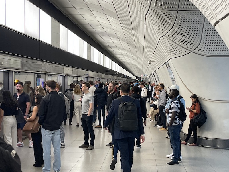
… but it’s still hugely impressive bearing in mind the line didn’t exist just over two years ago. One thing I do notice at peak times at Farringdon is there needs to be more Oyster/Contactless readers installed between the northbound Thameslink platform and the escalators down to the Elizabeth line. At the moment there’s just the one reader …

… and the queue of passengers waiting to use it causes considerable passenger congestion…
… with those queuing getting in the way of others trying to get through.

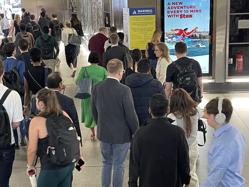
I’m not sure this passenger helped by taking his folded bike (allowed) on the train and up the escalator in an unfolded state (not allowed).
Beaulieu Park taking shape

The Chancellor may be halting all Restoring Your Railway projects but the new station at Beaulieu Park to serve 14,000 new homes being built just north of Chelmsford is coming on well…
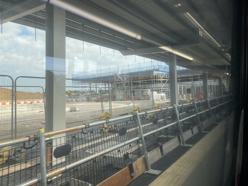
… as you can see when I passed through on the main line to Norwich recently.
Scheduled and Real Time
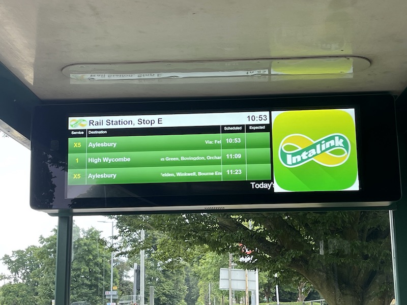
Some local authorities, including Hertfordshire, are now showing both Scheduled and Expected times at bus stops which does help to clarify whether the information can be relied on as you wait.
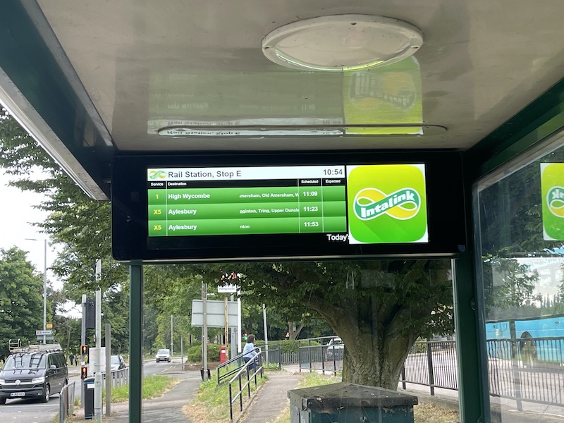
The photos of these screens outside Hemel Hempstead railway station (on my way to Tring) knocked the 10:53 departure on the X5 off at 10:54, which luckily the woman in pink who arrived at that moment didn’t notice as she decided to wait and sure enough at 10:57 the bus arrived. It would seem the “expected” field isn’t yet working.

Over by the station entrance there was this handy “Where To Board Your Bus” poster…

.. which was a bit behind the times.
Network South East at Home here
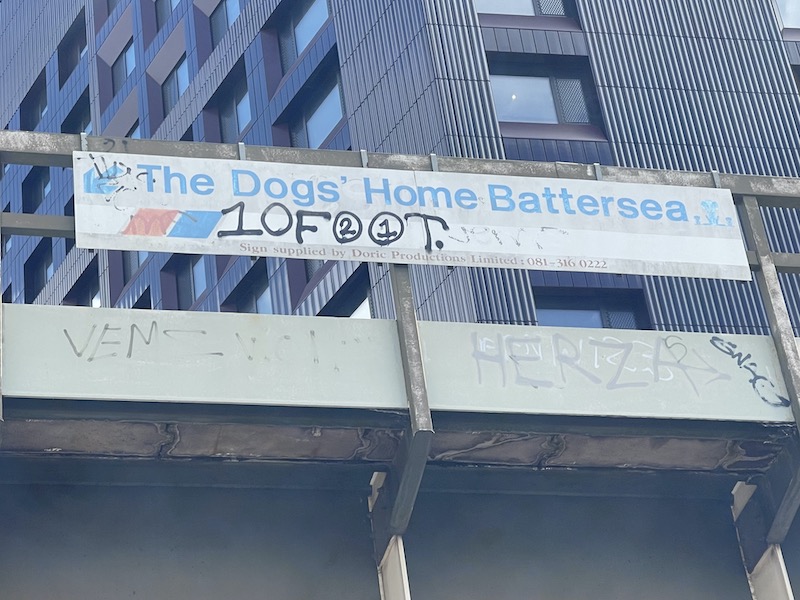
Fans of Network South East must enjoy seeing the sign on the bridge taking Southeastern tracks over Battersea Park Road alongside what nowadays is called Battersea Dogs and Cats Home. Shame about the graffiti.
Service Closed at Stratford

Increasingly I find the problem with electronic signs is no-one intervenes when they make no sense at all as in this example on a Greater Anglia train approaching Stratford on its way to Norwich.
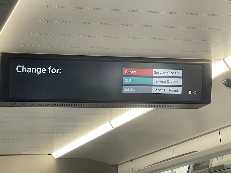
Passengers rightly lose confidence in anything that appears on screens and then pay no attention to them – this is also not helped by the constant See it Say it Sorted refrain too.

And while on that train, it was disappointing to see three of the five toilets (yes there are only five on a 12 coach train) “out of use”….

… including both accessible toilets.
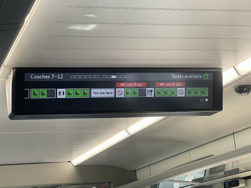
Unless it was the electronic signs that were “out of use”, which is a distinct possibility bearing in mind the other garbage information being displayed.
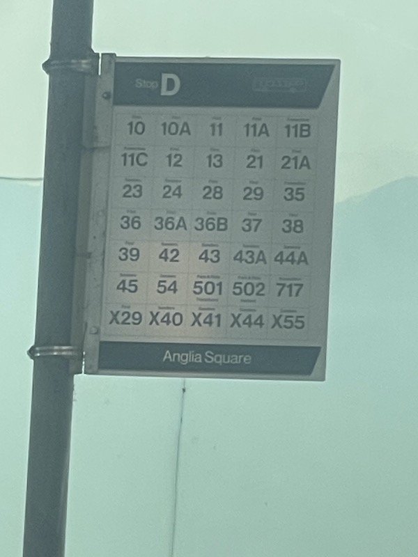
Is this Britain’s busiest bus stop?
Spotted in Norwich.
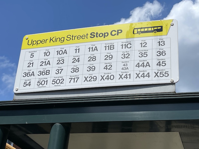
That’s 37 bus routes departing from Upper King Street, Stop CP. Not far behind at Anglia Square is Stop D which sees 35 bus routes.
Missing electric Vinyl

This month’s “why can’t they also replace the vinyl when changing a panel?” features a First Bus bus in Norwich that can only be a matter of a few months old yet is already missing a vinyl.

Chiltern’s friendly message

I was puzled on a recent Saturday morning when planning a trip on the Chiltern operated main line out of Marylebone to see the above stark “DO NOT TRAVEL” message on the company’s social media feed. All the more so as National Rail generated information was showing departures as normal, as was the Traksy website. Perhaps it was a way of encouraging custom for Nebula – the promotional tweet below the message – and “learn how to be successful and happy”. Or perhaps it was another electronic communication gone wrong (either the tweet was wrong or the National Rail feed).

CLJ’s annoying sign display

It’s a small point I know, but I was pleased to see two displays showing upcoming train departures to what I assume are the 19 most popular destinations (aside from Victoria and Waterloo) from Clapham Junction located on platforms 5 and 6 but it just niggled me the AtoZ display didn’t show the A to P on the left hand screen and P to W on the right and the double up of Portsmouth Harbour meant a 20th popular destination couldn’t be shown. And that sticker over Milton Keynes Central needed removing. I’m not sure why passengers had to enquire about Brighton (trains were running as normal) but there was disruption to Milton Keynes due to engineering works.
Update: I was being particularly dense on this as commentators have pointed out there are no direct trains from Clapham Junction to Brighton and the Milton Keynes service has been cut back to Watford Junction – so why not update the sign?
It’s the soap solution

Whenever I travel on a London Overground train I find the windows obscured by the residue from the train wash, and once again I found this on a recent journey. It’s a simple case of changing the mixture of the soap that’s used in the train wash, probably by diluting it – and that would solve the problem once and for all. Well, at least that’s what my engineering colleagues used to tell me about the bus washes at Brighton & Hove bus garages.

A limited stop pink lollipop

Those pink poles I spotted when travelling on Brighton & Hove’s new route 1X have finally come into their own as the lollipop style tops that were on order, and delayed, have finally arrived and David has been busy installing them along the route so passengers won’t get confused about which stops the limited stop buses observe, and which they don’t. (Thanks to David Grimstone for the photos.)

Not quite so smart…

… when it comes to positioning vinyls on windows. (Thanks to John for the photo.)
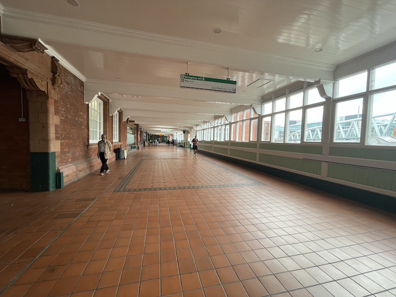
Plenty of room in Nottingham

Not only is the wonderful ticket hall area at Nottingham railway station now so spacious following its decluttering, but passing through the ticket gates to head to the platforms brings forth another spacious landing area. Is this Britain’s most spacious station?
This advert makes no sense to me

Knowing the DfT/Treasury’s stranglehold on all expenditure incurred by Train Operating Companies within their management contracts, I was surprised to see East Midlands Railway taking commercial advertising space at London Bridge station to promote its “Luton Airport Express” half hourly service from St Pancras. I’d have thought any passenger would jump on a Bedford bound Thameslink train (from Brighton) at London Bridge that will stop at Luton Airport and be there quicker by staying on that train than changing trains at St Pancras.

Dismal Oxford Circus

For what seems like years, the southbound Victoria line platform at Oxford Circus has looked like this at the southern end with a loss of what I would have thought is valuable advertising space to TfL. It just seems odd the months and years go by without anything happening to improve the image and poor waiting environment.
Nice seats in Ashford

Passing through Ashford the other day my eye was caught by the train like formation of seats in the Starbucks on platforms 1 and 2.
Time for an update

As I mentioned in Tuesday’s blog it was good to see Reading Buses had updated bus stops within the Council area for the new route 28, but this stop in Charvil in Wokingham Borough Council’s area used by Thames Valley routes 127/128/129 and Carousel’s 850 could do with a bit of a makeover.
Borough’s roundel
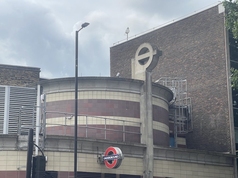
Walking past Borough Underground station the other day made me realise just how unusual the station design and roundel are….

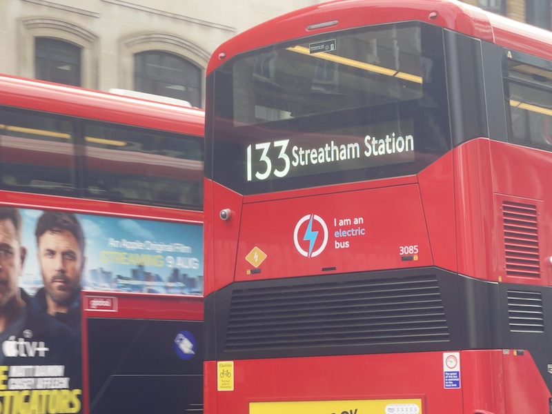
… and then I spotted, passing by, the bright new electronic blinds now installed on buses on route 133.

You’d almost think they were the old style linen roller blinds.
I Spy at Brighton station

I passed through Brighton railway station recently and in the Travel Centre spotted a pile of “i-Spy … on a train journey” books behind the glass. That would be fun to buy, I thought, but Peter, the friendly ticket office clerk advised they were free of charge as they had boxes and boxes of them to give away.
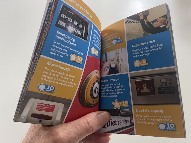
It offers fascinating coverage for the young budding rail enthusiast. Some of the spots are very easy including luggage racks and alarm handles, but, depending where you’re tavelling, some could be more challenging, such as “mechanical signals”….

… while one or two others are now impossible, if being a purist, such as a Class 460 on the Gatwick Express – and “every 15 minutes” – those were the days.

Incidentally it’s always nice to see the model bus display in the Brighton Travel Centre promoting the excellent Toy Museum in the arches below the station.

Delay sorting delays out at Northern

Northern win my wooden spoon prize this month for taking for ever to reply to a delay repay claim submitted on 26 June following a delay I encountered returning from Blackpool North that day. The Company says it aims to respond within 10 working days, but three weeks later I hadn’t even had an acknowledgment, so sent a complaint about how long it was taking, receiving an acknowledgement that “we aim to respond to you within 48 hours of your complaint being raised, and have 28 days to resolve this for you.” 48 hours later came the following message: “Thank you for your patience. We want to acknowledge that we are currently experiencing a high volume of customer contacts, leading to a longer response time than usual. Out team is diligently working to respond within 10 working days. We sincerely apologise for any inconvenience this delay may cause and greatly appreciate your patience during this time.” So the wait goes on.
Still on delay repay, I’m pleased to report after appealing GWR’s decision not to refund my delay trying to get to Henley on 6th July and resubmitting my Ranger ticket, but cut in half, together with an image of my Railcard (neither of which are specified as being required) I received a full refund. Case closed.
How not to present a bus timetable

There’s not much left of the Green Line network but Arriva ploughs on with its route 757 between Luton and Victoria. Hertfordshire County Council includes a straightforward presentation of the timetable on its website (shown above) but Arriva deems it necessary to confuse passengers by the following presentation….
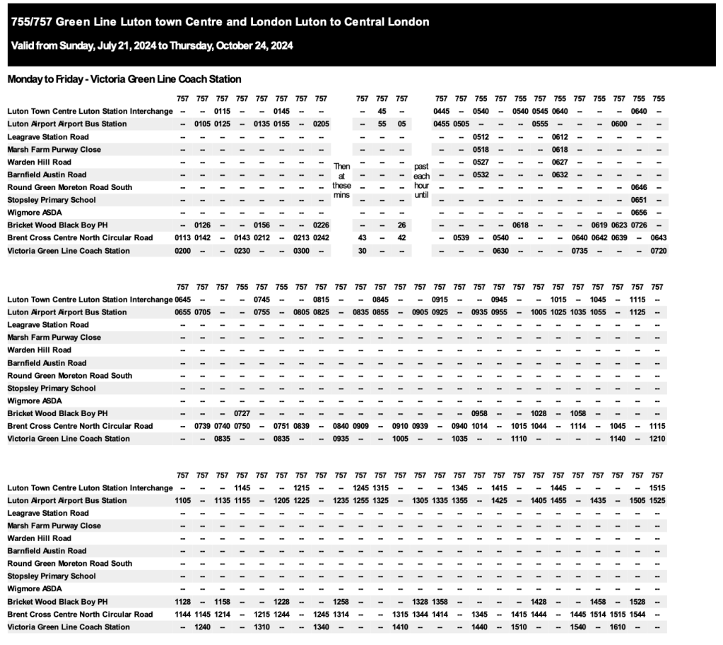
… you’d be forgiven for thinking there are three different routes – Luton Town Centre to Luton Airport; Luton Airport to Brent Cross and Brent Cross to Victoria – and you have to concentrate to find the spot connections between the columns. If Hertfordshire can present it properly, why can’t the bus operator?
More 133 matters

And finally for this month, while in Holborn yesterday it was pointed out to me TfL’s new design of bus stop timetable display no longer shows where a bus comes from on the line diagram – a stranger at the Chancery Lane bus stop shown above would be forgiven for thinking the 133 only operates between Chancery Lane and Holborn.
More miscellany next month
Roger French
Blogging timetable: 06:00 TThS with Summer Su extras.
Comments on today’s blog are welcome but please keep them relevant to the blog topic, avoid personal insults and add your name (or an identifier). Thank you.

I think TfL are right on only showing the places the bus is going to on the 133 timetable. Why would you want to confuse passengers by showing a list of places (and journey times) that they couldn’t reach from the bus stop they were standing at?
The treatment of the last buses is not good though – Saturday only has one shown whereas the other days have the final half dozen (which is much better). If I had to guess it’s because the software says only show the times of buses in the final hour of operation, so only 02:01 pops up. Another case of needing a human to look at what the computer is spitting out and overide it with something sensible.
LikeLike
It’s useful for people travelling to get the best understanding of the network that they can – and it may help them when they’re making their return journey to know that they came on the bus from Streatham rather than puzzling over why they can’t find any buses with a destination of Chancery Lane.
LikeLike
Not sure why they would be confused on the return journey, the bus stop would show the return route for the bus. The rule to me is only show the information on the timetable panel which is relevant to trips taken from that stop and if there is no poster frame in the shelter nearby, a guide to other stops in the area. I take your point that encouraging wider knowledge of the network is good, but that is what the spider maps are (supposed) to be there for.
LikeLike
I agree with philstubington – by all means show the complete timetable on the website or in a timetable book or leaflet, but at the bus stop the intending passenger just needs to know where the bus goes, and when. All other information simply adds to the time needed to be assimilated – and then to be identified as irrelevant! One person taking too long to find the information they need may also prevent other people finding their required times.
In practice many operators get this right, but I do recall that in some rural areas of the south west of England in the early 1970’s, Western National used to post displays with the complete timetables of several routes in the local area, but without any indication of which routes actually served the specific stop. That approach no doubt saved printing costs, but was hardly helpful for visitors to the area – of whom there were (and are) a large number!
Nigel Frampton
LikeLike
I’m afraid this is yet another example of TfL dumbing down their information.
On a related note, the description ‘every 8-13 mins’ (for example) usually means the frequency is mostly every 10 mins, say, but a few journeys in that time range have gaps of 8, 9, 11, 12 or 13 mins. So it’s a way of being totally truthful
but in the process removing useful information! Most annoying
LikeLike
@anon 09:22 and @Roger – very similar information is provided on Morebus’ stop-specific timetable displays. The first stop shown is marked “you are here”, with principal subsequent points up to the destination. But no preceding points (which are in any case irrelevant, the bus from that stop won’t take you there as others have already noted)
Generally, individual departure times or “minutes past each hour” are listed (but then service frequencies on most routes aren’t “turn up and go”). However I spot-checked a stop on the m1 earlier, Mon-Fri and Sat are shown as “up to every 8-10 minutes” for the bulk of the day. Only in the early morning and mid-to-late evening, when frequency is lower, are individual departures listed. Sundays are also itemised. Even more vague is the U1 during term time on Mon-Fri – merely shown as “at frequent intervals” between 08:00 and 19:00.
@anon – Would you accuse Morebus of “dumbing down their information” too?
Malc M
LikeLike
Not as much as TfL has!
LikeLike
Sadly these type of meaningless timetables are becoming the norm
LikeLike
The timetable in the image above shows when the departures are and where the route is going. It’s hardly “meaningless”….
LikeLike
I think the OP’s comment related to the Arriva 757 abomination, not the TfL 133 one, although it’s little tricky to be sure with Word Presses’ nesting of comments.
LikeLike
Escalator queue, I’ve noticed that less and less people are willing to walk up escalators on the left, even the Lycra clad super fit younger generation seem to only want to stand.
I always find it good exercise. It even happens on the down escalators as well.
LikeLike
Arriva’s presentation of timetables, especially on longer routes that are on split registrations, has been dire for a long time. The worst one in this neck of the woods is the X93/X94 between Scarborough, Whitby, Guisborough and Middlesbrough, where each “connection” between the three legs of the route involves skipping over one or two columns. With this being a popular route for tourists and visitors, it is particularly unhelpful, as they were less likely to understand what is going on than locals who travel regularly. At one point they did used to upload an actual proper timetable leaflet onto the website as well as the computer-generated junk, but alas no longer.
LikeLiked by 1 person
WOW!! I had no idea that this route survives . . . even once a week.
Roger’s route dates back to Amersham and District and the mid-1920s. A&D was an East Surrey-like company; independent, but supported / part-owned by the LGOC. In the grand renumbering of 1935, LPTB allocated the route number 397, and it would retain this number until the 1960s, when one of many network revisions by LT changed the number to 394.
The Chesham rurals went through a period of slow decline until deregulation, when they were deemed non-commercial, and Bucks CC took charge of the routes . . . the Red Eagle page seems to show what is left now.
Route 397 (Tring-Chesham) was the busiest of the routes . . . in 1960 there was an hourly frequency on Mondays to Saturdays (right up to 10pm), with buses two-hourly on Sunday afternoons. The diversion to St Leonards came about by 1975, when a parallel route 349 via Cholesbury was withdrawn.
Bucks CC seem not to be enthralled by DRT . . . maybe they’ve been reading Roger’s blogs passim? I wonder how much longer these routes will survive.
LikeLiked by 1 person
The poor external wash quality of Overground trains also annoys me. I believe it is called ‘spotting’ and as Roger says it is down to improper mixture of wash ingredients (can’t think of a better word) It doesn’t just affect Arriva trains but their buses too. Travelling through central London on a 38 it is often difficult to see through the upper deck front window due to the level of grime. Indeed I do wonder if they employ any cleaners and who supervises them as the buses are often dirty inside too. Perhaps the garage engineering manager could take some action here ? TfL of course shows little interest and you can imagine the response if you submitted a public complaint. It’s a shame as some garages have resplendent vehicles while others don’t. Part of the lottery and miscellany of London’s bus services.
Martin W
LikeLiked by 1 person
Obviously the Battersea graffiti was by a p-way enthusiast.
(I assume most here will know, but just in case you don’t know… The ‘ten foot’ is the space between pairs of running lines on a 4 (or more) track railway, eg between the up/down fasts and the up/down slows The ‘six foot’ is the space between the up and fast lines. And the ‘four foot’ is the gap between each rail of one track)
LikeLike
*6ft is between the up and down. I really should proof read before posting.
LikeLike
| 6ft is between the up and down
Between immediately adjacent tracks, pedantically, regardless of direction.
It would still be the six foot if it was between the Up Fast and Up Slow (if tracks were paired by direction rather than speed) or between two parallel single lines.
LikeLike
I think the reason the Clapham Junction sign says “Please enquire” for Brighton is that there are no longer any direct trains and it is necessary to change (annoying when there used to be a half hourly direct service). Shame they can’t find a way of actually saying that a change is needed.
LikeLike
’Please enquire’ also I think tends to happen when the last train has gone. Similar to what seems to often happen with bus real time screens, which show ‘times not available, please check timetable’ when the last bus has gone. It would be much better to be honest and admit that ‘Last train / bus has gone’
LikeLike
An added complication with rail now is finding real timetables is a black art they do their best to hide them in many cases
LikeLike
I really don’t understand WHY they try to hide timetables. Do they think people will hold them to account more if they have them?
LikeLike
| Do they think people will hold them to account more if they
| have them?
It’s because an ever-increasing proportion of people can’t read timetables, get it wrong and refuse to accept that they misread them.
Heck, half of the smartphone generation can’t even follow the step-by-step instructions they’re given by Google/Apple Maps!
Less cynically it’s actually because the big timetable posters cost money to print and fit, and as we all know the DfT mandates penny-pinching.
LikeLike
“Heck, half of the smartphone generation can’t even follow the step-by-step instructions they’re given by Google/Apple Maps!”
That is quite the generalisation. I’ve dealt with people in their 60s and 70s that had no idea how to read a timetable either, and likely never did. It’s nothing new!
-blue
LikeLike
When I looked at the photo of Borough station I thought, “Ah, it’s one of the WW2 Deep Level Shelters” which are to be found at other locations such as Stockwell. But it isn’t. One wonders whether (or not) the architects were making a deliberate allusion to these?
Andrew Kleissner
LikeLike
The legendary oyster reader at Farringdon, very popular for those whom think payment is optional as they can simply touch out and jump onto a Thameslink to either an unbarriered station for free or buying a short ticket to bypass the barriers at their destination.
RPIs love hanging around it to pounce on said passengers. Probably second only to Stratford for misuse and should simply get removed.
LikeLike
It was chaos at Farringdon before they installed the readers (there are actually two between the northbound Thameslink and the Elizabeth Line). People switching between paper tickets and Oyster/Contactless had to go via the ticket hall, and loads of people were getting caught out not tapping in when they got to places like Paddington.
Don’t forget Thameslink comes from places outside the Contactless area, so loads of people need somewhere to tap in/out – you cannot get rid of the readers, as some numpty from TfL decided they weren’t necessary in the beginning, which turned out to be an obvious (to people who use the system) faux pas
LikeLike
The new electronic blinds (Route 133) are very good and will vary in brightness depending upon the light. In very bright light they will go greyish thereby making them easier to read. All the newer buses are fitted with these blinds. The only disappointing aspect is that we enthusiasts of blinds are no longer able to watch blind changes as we can with the roller type.
LikeLike
Thanks for the effort that go into your blogs, I enjoy reading all of them and they’re the first place I go to for trip inspiration! Will be trying the 199 route at some point in the future, had no idea it existed 🙂
LikeLike
Here here! As a result of info gleaned from one of Roger’s blogs, I was recently inspired to have an excellent day out on the Peak District open-top tourist buses. Recommended! …. and thank you Roger
LikeLike
I have seen the Herts RTI screens showing expected times elsewhere in Herts though it is a little patchy between operators and/or depots as to who appears to be feeding and who isn’t. One slightly odd feature that I experienced is that the system seems to list off the scheduled time and even when a bus is running late it vanishes off the screen after the scheduled time has passed even if the expected time was saying it was still 10-mins away (at least that happened at the couple I viewed a couple of weeks ago) so if you are waiting for a bus you still end up with a period of uncertainty between when it was due and when it arrives if running late which is exactly when you want the system to reassure you it is still coming.
Dwarfer
LikeLike
Yes, I’ve noticed this too and reported it. It’s due to a software bug that is being resolved, apparently.
LikeLike
Regarding the First Wright Bus GB Kite Electric bus with missing vinyls. I’ve noticed that First’s new electric buses come in a new livery, which is fine except First spent considerable time, and money on adopting local liveries, thus engendering good will as Leeds green, Sheffield blue/cream, and Norwich red all reflected past local liveries. Now this has been undone with a universal “electrics” livery. Can they not just stick with something? Visually it’s messy, but perhaps it’s for shareholder gratification.
On a more positive note I love the pink 1X bus stop poles with lollipops. They certainly make the express stops stand out.
Peter Brown
LikeLike
First has decided to adopt a corporate livery which is based upon the electrics scheme, though with exceptions in Solent and Leicester that are tied to local agreements. I’d suggest that the reorganisation of the operating companies so that management is more thinly spread is more of a concern than the livery that the buses wear.
The flip side of individual local schemes is that you end up with the situation that exists in places like Bristol and Bath, or Cornwall, where there are a myriad of vehicles in redundant liveries as PVRs have shrunk, vehicles cascaded, etc. In First Kernow, you see vehicles that have been cascaded in wearing all sorts of schemes – standard urban, Scottish urban, urban with various coloured fronts (courtesy of Norwich, Bristol and Huddersfield), Bath blue, Doncaster red….and that’s before the raft of indigenous local schemes – some current, some defunct. It’s a mess and perhaps a few less local schemes isn’t a bad idea.
That said, there should be a place for some entrepreneurial spirit, with perhaps specific dispensations for particular high profile services like the Excel route in Norwich, or open top services.
Whether many people outside of the enthusiast fraternity remember Leeds buses being green (not since the 1990s) or Sheffield buses being blue (since the early 1970s) is a moot point. Norwich itself doesn’t have red buses (aside from a couple of heritage ones, and the Excel ones running in from King’s Lynn) as those operations retained corporate colours with coloured fronts applied. Are you thinking of the Lowestoft and Great Yarmouth operations, where the local services (not the Coastlink or Coaster trunk routes) are branded as Coastal Reds?
BW2
LikeLike
Actually I think I’m thinking about Ipswich Reds? As you say the plethora of First liveries is a mess, and it seems that First buses often stay in the livery they were delivered in, so when a new livery is announced the local fleets never get fully updated. Are the Buses of Somerset all green? Are all the buses in Weston-super-Mare all in Badgerline livery? They missed an opportunity to gain local goodwill in not making the latter cover the former West of England area as Badgerline is remembered favourably by the public.
Peter Brown
LikeLike
The downside of sticking vinyl’s to the Glass parts is when they are replaced the branding looks awful. It was a similar problem with First’s large Overground branding that after a while looked a mess
LikeLike
I think Norwich Tombland stop CM (100m from stop CP) might have more services.
It certainly has more passengers as all services leaving the city heading north or north-east stop there. It’s certainly very busy at 5:30pm as bustimes.org shows.
LikeLike
Thanks, Roger, for another interesting blog. The 199 should appear on the Hertfordshire map as it comes into the county. In purely geographical terms, the 199 serves far more of Herts than the 331 (the TfL north London one!) does which is included and so will be added.
Dan Tancock
LikeLike
Excellent news Dan; thanks for arranging this.
LikeLike
Great responsive reply! Being nosy, I’m puzzled why it’s currently missing, especially as it sounds like it’s a long-standing route
LikeLike
Regarding Clapham Junction and “that sticker over Milton Keynes Central“. Well, obviously it needs removing. It should never have appeared: it’s an electronic screen! The whole point is that it can be altered easily and, you’d hope, remotely. An ideal time would have been a couple of years ago, when the Southern service was truncated at Watford Junction (mostly, then, completely now). So: nothing to do with engineering work.
Given that it’s an electronic screen, why wasn’t Watford Junction simply swapped in?
It’s all very well installing electronic kit, but someone really needs to give a bit of thought as to how it’s going to work on an ongoing basis (which they clearly haven’t bothered to do).
Paul B
LikeLike
Thanks Paul; I completely overlooked that trains no longer run to Milton Keynes (nor Brighton) from Clapham Junction – do, as you say, why not update the sign and delete these locations.
LikeLike
I’m surprised that East Croydon isn’t regarded as one of the 19 most popular destinations from Clapham Junction.
Steven Saunders
LikeLike
I’m surprised you can’t get to Brighton from Clapham Junction anymore, although I suppose it was always on the slow service, so changing was quicker anyway.
LikeLike
In fact the answer to most enquiries about Brighton services is probably “get the next train to East Croydon from platform 13 and change”.
Steven Saunders
LikeLike
Two more quirks re those Clapaham Junction screens: the two Portsmouth Harbour lines show different next trains, and the two screens show (slightly) different current times.
And why not put the TfL lines at Stratford shown on that GA screen in alphabetical (or some other logical) order?
Mike M
LikeLike
Maybe the two Portsmouth Harbour rows were intended to show Portsmouth Harbour via Gatwick and Portsmouth Harbour via Guildford, but whoever feeds the data forgot!
LikeLike
The lack of alphabetical flow on the Clapham Junction screens reminds me of the similar display with many screens at the main entrance to Victoria Coach Station where formerly the destinations stayed the same and flowed nicely A-Z from left to right so you could see at a glance which gate to go to but now you usually have to wait for your destination to scroll round
LikeLike
The electronic sign at Clapham Junction typifies our railway system and much of public transport, good idea to provide that information in one place but there is no continuing interest to keep it up to date and accurate. Any transport provider worth his salt would now get this sorted immediately. What’s the betting it’s still wrong in a months time?
LikeLike
Those seats in Starbucks are actually original Mark 3 coach seats as seen on Intercity trains years ago. Really good up-cycling but did Ashford ever see Mark 3 coaches?
LikeLike
Goes to show how reclined the IC70 is. I can’t think of MkIII ever operating to Ashford but in a similar vein IIRC NSE up cycled some APT seats into their slam door long distance units that served Ashford
LikeLike
Another enjoyable round-up. Re the Chesham area shoppers’ routes, the 190 via The Lee is a delightful run too, though fitting in a beer break in the excellent Cock & Rabbit mentioned on the timetable is sadly a challenge. Re bus stops served by multiple routes, the reverse has happened in Ealing, where the E2 and E8 to Brentford now annoyingly call at separate stops (though the Countdown on the previous jointly-served stop hasn’t been amended/updated accordingly). And as for incorrect info from Chiltern Railways, last week I was waiting at Sudbury Hill Harrow and was startled to hear an announcement that due to a platform change the next train to High Wycombe would call at Platform 1. This is an operational near-impossibility as it would involve running wrong-line – Platform 1 is served only by the London-bound line! Keep up the good work – Graham L.
LikeLike
While changing trains at Farringdon recently I found a perplexed passenger holding their phone reading the notice above interchange validator.
The notice is written by someone who knows the “rules”. It implies you only touch it if you have a smartcard or bankcard and when changing from National Rail to Elizabeth Line not vice versa.
The reader is white not yellow as shown on the sign and I assume phones can be used that nowadays hold multiple tickets for family members.
On the subject of ticket validity I only recently noticed the Moorgate branch has disappeared from the tube map as Oyster cards are no longer valid. The line on the has been simply “rubbed out” with Old Street still shown as an interchange circle. I found Old Street has three interchange validators with the Northern Line. New signs have been installed here.
Moving to atmospheric Essex Road where I found a station stuck in another era with Network South East platform signage including a superb trackside diagram in red showing trains to Welwyn Garden City and Letchworth. Services from King’s Cross to Peterborough and Cambridge are also shown.
I popped up to Highbury & Islington to find no validators only notices in interchange passageways with only signs pointing to the northbound Victoria line stating you needed an Oyster card.
The trackside walls on the Great Northern platforms here are filthy along the whole length in both directions!
Crossing to the Victoria line, I can only admire the excellent service courtesy Working Timetables published online by TfL as many trains I have caught recently are on time to the second. Forty one trains serving 32 platforms with 1 minute 50 seconds layover at each end in the weekday peak.
The only time it has let me down in many years was when travelling to catch the 09:25 701 from Brighton when trains were held in platforms due to a points failure at King’s Cross!
On the Brighton publicity front it is disappointing that the excellent route maps that for many years featured in Bus Times and at Bus Stops with all stops named are being replaced with by a revised format with not all stop names shown.
This came to light while checking online to check how many stops remained while travelling to Downs Park Sainsburys in a venerable Scania with clean windows that once allowed me to view bus stops with route numbers served by the colour coded “Metro” network!
John Nicholas
LikeLike
We know that the main improvement to bus operations is more priority infrastructure, but how can we move forward when councils capitulate like this? The article said there were 800 objections. Surely more than 800 bus passengers travel along this street each day? Do they not outweigh the objections? Did anyone ask Stagecoach about their loadings along this street?
We also know that traders always overestimate the number of customers arriving by car and parking on the street. Most customers to local shops arrive on foot and by bike. Shouldn’t councillors be acting as leaders and explain these facts to objectors?
https://www.creditoncourier.co.uk/news/red-light-for-exeter-bus-lane-plans-707941
Peter Brown
LikeLike
More positive bus infrastructure news from Reading.
The article references the high bus use statistics for Reading and obviously this is connected to the proactive council working with their own bus operator.
Brighton also achieves a similar success with the council and an enthusiastic operator. Clearly Exeter is not in the same league. If only Devon General hadn’t sold out to Stagecoach and carried on with their high frequency minibus network which did so much to drive up bus use there.
https://highways-news.com/work-due-to-start-on-new-east-reading-bus-lane/
Peter Brown
LikeLike